Tag Archive: united states


BIG Goes Big in New York and Frankfurt

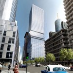
2 World Trade Center, New York City by BIG

2 World Trade Center, New York City

Danish architect wunderkind Bjarke Ingels has recently landed a couple of projects that justify the name of his architectural company BIG. While he has long reached far beyond his home country of Denmark, the commission to design a new building at 2 World Trade Center in New York City, which was revealed on June 9th, will finally put him onto the world map of architecture.

It will be his largest project to date, both in terms of height as well as the public exposure that building at this emotionally laden location brings along. In fact, one could say that there’s a generation change happening here. The former 2 World Trade Center design was created by British Architect Norman Foster, who just turned 80 this June. As an architect, he has arguably reached everything one could dream of. Bjarke Ingels on the other hand is half Foster’s age, 40, and still has plenty of time to catch up with him – and seems to have come quite far given his young age. The decision to hire him as the architect of 2 World Trade Center, replacing Foster, is in this respect a very interesting one.

"Tessuto"/"Metz" Tower, Frankfurt by BIG

“Tessuto”/”Metz” Tower, Frankfurt

Just a couple of days later, on June 17th, Ingels won another “big” scale project, this time in Germany. He will build a 185m tall mixed use tower in the financial district of Frankfurt. Coincidentally, his building there will actually be a neighbor of Norman Foster’s Commerzbank Tower. The unique aspect about Ingels’ design is the eight floors of apartments that are found at half the height of the building, while office floors are stacked both below and above the apartments. Ingels claims that placing the apartments like this relates to the “human scale”, though considering the proximity of the building to the Main Tower with its visitor platform at a height of 200m, it seems plausible that the apartments have not been placed at the top of the building to prevent insight into the apartments from the Main Tower’s observation deck. On a side note, this will be Germany’s first building mixing office and residential uses.

(Renderings by BIG)
At Louisville, Museum Plaza Taking Shape

Louisville, Kentucky, USA is most probably not a city that’s on the radar of many people. The city of roughly 700.000 inhabitants located at the Ohio River is hardly known outside the US. This might change though, at least for people who are interested in architecture, since the city is the site for what is probably one of the most polarizing current architectural projects, “Museum Plaza”.

Originally planned as a new art museum and art center, it became soon clear that a fairly large selection of other uses for the building would be needed in order to come up with the running costs of the complex. In the end, it was decided to build a mixed use 62-story skyscraper including luxury condos, offices and a hotel besides the main art space. Since the contraints of the building site were very difficult, the New Yorker architectural office REX (led by Joshua Prince-Ramus, who was once a partner of Rem Koolhas at OMA) had to turn usual architecture standards upside down, in the truest sense of the word.

REX’s project website shows an (at first sight) somewhat ugly and non-proportional building. It takes some time and explanation to get behind the idea of this building and see why it’s special and what makes up the actual concept. And that concept is explained by Joshua Prince-Ramus at TED TALKS, the video of which can be seen at the company’s website. Prince-Ramus talks about three different projects, Musum Plaza is the last one, about two thirds into the video. The solution of lifting the public parts of the building way up into the air becomes clear as he talks about the constraints and circumstances of the project. From this perspective, the clumsy building seems to fulfill its intention and will also provide a new architectural landmark that will probably give a boost Louisville’s reputation (at least, I would like to see that monstrous building in person).

The video and presentation finishes with an animation about Museum Plaza that is very well worth seeing, even if you’re not interested in the architecture itself. The way the video was filmed and the way it seamlessly combines shaky hand-camera filming with rendered and animation sequences is breathtaking. If you don’t want to load that whole video to see this, you could also see the video at YouTube, albeit with a much worse quality.

All content © by Tobias Münch.
On Architecture – A Kotogoto Project