Tag Archive: oma


Goodbye TVCC

Rem Koolhaas’ TVCC building under construction in Beijing burned down on Monday and was practically renderered unusable.

The TVCC building in Beijing, adjacent to the already famous CCTV headquarters building, caught fire on Monday and was almost completely destroyed. The building was still under construction and was supposed to be occupied by a hotel and cultural facilities. It was designed by Rem Koolhaas’ office OMA, who also designed the main CCTV building (which obviously was unharmed by the fire). TVCC was one of my most favorite current skyscraper designs due to its unique irregular geometric form. Plus, it made a visually convincing companion to the CCTV building next to it. It is deeply saddening to see it burn down like this. The disaster, which took place on the last day of the Chinese New Year celebrations, when the city was engulfed in fireworks, is considered a bad omen for the new year by many witnesses.

Photos at Stern.de
Article at The New York Times Online (with video and audio commentary)

O For Hafencity

Acclaimed Dutch architect Rem Koolhaas places an O at the Elbe shore, in form of a building to house the new Hamburg Science Center in the upcoming Hafencity district.
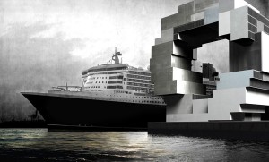
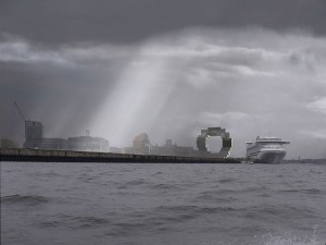
Last Monday, Dutch architect Rem Koolhaas, head of the Office for Metropolitan Architecture, presented his revised design for a building to house the Science Center, to be situated at the waterfront at Hamburg’s Überseequartier district, part of the Hafencity development which is currently under construction. Sadly, I couldn’t make it to the presentation myself, so I have to rely on information from newspapers and the press release at the OMA website.

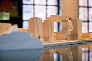
The previous design by Koolhaas, which won the competition for the building in 2004, looked like an amethyst, with a round back, flat front and a hole right in the middle of the building, as seen on this photo at the bottom right of the display. This hole is pretty much everything that remains of this concept. The new building looks like a bunch of stacked containers forming something that resembles a huge letter O. According to Koolhaas, he was inspired by the harbour and the huge container terminals.

At a height of 70 meters, the Science Center will be among the taller buildings in the new Hafencity district, creating an iconic landmark right at the waterfront, though located far enough from the Elbe Philharmonic Hall as to not interfere with this most ambitious building in the new borough. The Science Center will house a science park, aquarium, shows and laboratories that will illustrate scientific relationships by use of different media and a “do it yourself” experimental park.

The presented design and illustrations are still somewhat rough, making it hard to imagine how the final building will look like. For example, there has not yet been a decision on the materials for the building’s facade. The hole in the very middle of the building is not a new concept from OMA. The most notable example is their CCTV building currently under construction in Beijing for China Central Television – a skyscraper which winds dramatically around a central void, with two slanted towers and a breathtaking overhanging section that connects those towers to form kind of an endless loop. Though not yet finished, the building is already considered an architectural icon of the early 21st century. The design for the Science Center will surely not reach such high acclaim, but it could prove to be a distinctive and memorable addition to the skyline of a newly forming borough.

(Illustrations by OMA)

At Louisville, Museum Plaza Taking Shape

Louisville, Kentucky, USA is most probably not a city that’s on the radar of many people. The city of roughly 700.000 inhabitants located at the Ohio River is hardly known outside the US. This might change though, at least for people who are interested in architecture, since the city is the site for what is probably one of the most polarizing current architectural projects, “Museum Plaza”.

Originally planned as a new art museum and art center, it became soon clear that a fairly large selection of other uses for the building would be needed in order to come up with the running costs of the complex. In the end, it was decided to build a mixed use 62-story skyscraper including luxury condos, offices and a hotel besides the main art space. Since the contraints of the building site were very difficult, the New Yorker architectural office REX (led by Joshua Prince-Ramus, who was once a partner of Rem Koolhas at OMA) had to turn usual architecture standards upside down, in the truest sense of the word.

REX’s project website shows an (at first sight) somewhat ugly and non-proportional building. It takes some time and explanation to get behind the idea of this building and see why it’s special and what makes up the actual concept. And that concept is explained by Joshua Prince-Ramus at TED TALKS, the video of which can be seen at the company’s website. Prince-Ramus talks about three different projects, Musum Plaza is the last one, about two thirds into the video. The solution of lifting the public parts of the building way up into the air becomes clear as he talks about the constraints and circumstances of the project. From this perspective, the clumsy building seems to fulfill its intention and will also provide a new architectural landmark that will probably give a boost Louisville’s reputation (at least, I would like to see that monstrous building in person).

The video and presentation finishes with an animation about Museum Plaza that is very well worth seeing, even if you’re not interested in the architecture itself. The way the video was filmed and the way it seamlessly combines shaky hand-camera filming with rendered and animation sequences is breathtaking. If you don’t want to load that whole video to see this, you could also see the video at YouTube, albeit with a much worse quality.

All content © by Tobias Münch.
On Architecture – A Kotogoto Project