The Elbphilharmonie opened its doors and started its music program on January 11, 2017. Tickets are in high demand and are always quickly sold out when they are released, which usually includes the online shop crashing due to the high amount of users. After all this time waiting to for the building to be completed, it seems everybody wants to see it with their own eyes of course and experience the acoustic qualities of the concert halls for themselves. I was lucky to snag tickets for two concerts in February and naturally, I also had a detailed look at the architecture and tried to snap as many photos as I can. So let’s go and explore the Grand Hall and its foyers, shall we?
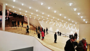
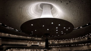
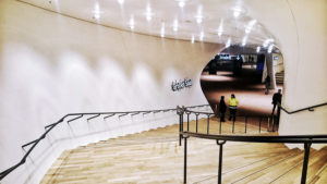
Every visit to a concert starts at the Plaza, the public space on top of the old warehouse. From there, after passing the admission control, you walk up the large circular stairwell, emerge on the right side of this photo and find yourself in the space shown above. The ceiling here is actually the underside of the Grand Hall, or more precisely its outer shell, as the hall itself sits in an inner shell that is acoustically decoupled from the rest of the building. From this entrance space, further stairs lead up to the various floors that encircle the Grand Hall and serve as foyers. Complex architectural layering of the floors and the resulting spectacular views keep pulling you upward. Quite some stairs to climb, as the foyers reach up from the 10th to 16th floor of the building!
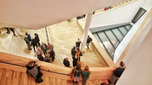
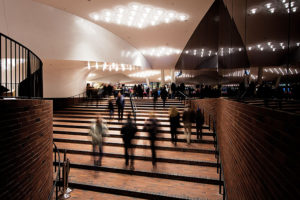
Looking down to the foyer’s entrance level that was showen in the first photo. The light well on the right side provides a view down to the Plaza. Or if you are on the Plaza without a concert ticket (yet), it teases you with glimpses of the foyer.
Layers, perspectives and geometry in the Grand Hall foyer.
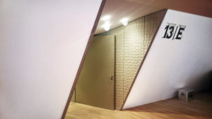
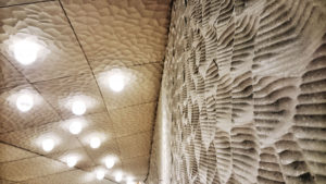
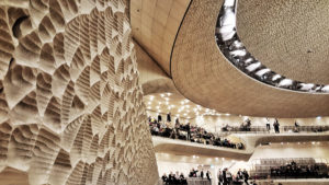
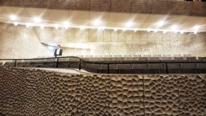
I really like the transition from the white walls of the foyer to the wall cladding of the Grand Hall. Unfortunately, I can’t really say the same about the white walls themselves, which look odd to my eye. The finish on the walls is quite uneven. While it doesn’t really show in this photo, you can get a better impression of it from my previous photo. While I’m sure it’s intentional to use a finish like this (perhaps to make the walls less susceptible to dirt), for some odd reason it reminds me of the dreadful wipe technique that people used to paint their bedroom walls in the 90’s. Personally I would have preferred a flat white surface like on museum walls.
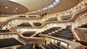
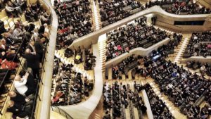
Here it is, the Grand Hall in all its glory. It is a truly spectacular and beautiful space. I was also surprised about how strong the verticality of it actually is. In order to give every single seat an unobstructed view of the stage, terraces and seating are arranged very steeply. Of course I had read about this concept, but experiencing it in person is a different story altogether. Some of the steep access stairs on the uppermost tiers can indeed take a bit of courage to climb, with only a railing separating you from the abyss.
This photo also shows the fabric screens that can be placed in front of the walls (the screens rise from the floor) in various sections of the hall to alter the sound, presumably to make it more “direct” without the diffusion that the structure of the actual walls provide. At least this is what sounds (no pun intended) logical to me, although I am no acoustician.
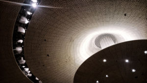
A UFO has landed in Hamburg! And inside the Elbphilharmonie, too. This is the large sound reflector that is suspended from the ceiling of the Grand Hall. It helps to distribute the sound waves and improve the acoustics in the hall, providing every seat with good sound.
Another view of the sound reflector and the ceiling.
The walls and ceilings of the Grand Hall are covered by 10,000 unique sheets of gypsum fibre panels. Each of these sheets was individually carved using a CNC mill. The dents are of varying depth (they are generally shallower within arms reach of the walkways and deeper on the ceilings) and individual recesses even spread across multiple tiles, forming a giant puzzle that covers the entire hall. At some point during the planning and construction process, someone came up with the term “white skin” (in German “Weiße Haut”), and while architect Jacques Herzog mentioned in an interview that he dislikes that term because it reminds him “of a dead body’s skin, like a water corpse”, it was already too late: the media had already adopted the idiom and by now it is widely used. In reality, just like Herzog suggested during the interview, the surface is more reminiscent of a crustacean’s shell. No matter what term you use though, the surface is both beautiful and crucial to the sound of the Grand Hall.
At some places like around the organ, the wall panels turn into grates whose structure blends seamlessly with the rest of the walls. Their appearance is also a faint echo of the fence that Herzog & De Meuron created for their 80 Bond Street apartment building in New York, completed in 2007.
Take your seats everyone, the performance is about to begin!
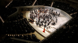
Applause! Pianist Alice Sara Ott leaves the stage after her magnificent performance of Ravel’s Piano Concerto in G major together with the NDR Elbphilharmonie Orchester, directed by Thomas Hengelbrock, on February 14th, 2017.
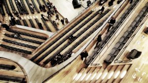
After a concert has ended, you can usually roam around the hall freely for a while. While many visitors leave quickly, others walk around and explore the hall. Since all tiers are connected by stairs, you can walk around the entire space and check out all the different perspectives. This photo shows the view straight down from one of the upper tiers. Also visible is the floor signage that guides you to your seat.
More wall and ceiling panelling, showing the seams and how individual dents stretch across several panels. I could marvel at these surfaces for hours.
Leaving the Grand Hall and walking down the curvy stairs to the Plaza. And the most important question is of course: how does the Grand Hall sound? It depends I guess. I’ve had the chance to experience both an orchestra concert and a pop concert and the difference was remarkable. My first concert was Junius Meyvant, a jazz-pop musician from Iceland, and the sound was not very good. His voice was difficult to understand and the bass was muddy and buried in the mix. My guess is that this was in part due to bad mixing and/or a bad PA system, which consisted of a ring of speakers around the stage blasting the sound into all corners of the hall. Maybe the hall is not really suited to this kind of amplification though. And in fact, in an interview with German newspaper “Welt am Sonntag” in July 2014, acoustician Yasuhisa Toyota said “We were concerned about natural acoustics for orchestral music, not a sound system with loudspeakers and amplifiers.”
Had this concert been my only impression of the hall, I would have left puzzled to say the least. Luckily I was able to return just a few days later, this time for a classical concert performed by the resident NDR Elbphilharmonie Orchester along with pianist Alice Sara Ott, and here the sound was a wholly different animal altogether. Very transparent and clear and you could make out every single instrument. It was a joy to close your eyes and get lost in the music and pick out all its nuances. So if you plan to visit the Elbphilharmonie, my recommendation from my personal experience would be to choose a classical concert. If you can get any tickets at all that is, as they always sell out very quickly at the moment.
