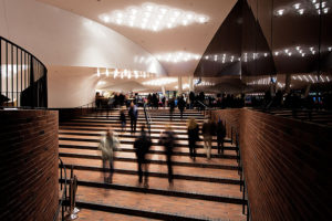
 Today was the day that the Elbphiharmonie Plaza in Hamburg, Germany opened to the public. It is the new public space that connects the old former Kaispeicher A warehouse with the glassy concert hall addition on top of it. My first impression of the Elbphilharmonie Plaza: yes, the views of the river, the harbor and across the roofs of the Hafencity are splendid, but the real tresure here is the interior: It feels very solid, yet at the same time light and airy. A beautiful combination of the chunky red brick floor (which hints at the building’s past as an industrial warehouse) and the elegant white curves of the ceiling (which are in fact the underside of the concert hall above) and the undulating glass walls that separate the interior from the open air deck outside. The reflections in the dark mirrored walls add yet another dimension. From the few visible columns and the openness of the layout (though some of it is feigned by the reflecting walls), you wouldn’t guess that there’s an entire high-rise building above this space. Build quality and materials are top notch, nothing seems over the top flashy and nothing is desperately trying to be modern to the point of being tacky or too contemporary. The interior strikes a wonderful balance and creates a beautiful and breathtaking public space. Despite the “difficult” and long construction process, they managed to turn this into an inspiring gem of a space. And if this is a hint at the quality of the concert hall, which will open its doors in January, I can’t wait to see that one with my own eyes. Until then, I will certainly visit the plaza more often to take in its unique and inspiring atmosphere.
Tag Archive: architecture
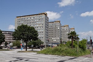
Today however, times have changed and the buildings are generally regarded as an ugly remnant of the reconstruction of Hamburg and the economic miracle of the 1950’s and most people would be happy to see them demolished. Which is exactly what is about to happen. Once the current tenant, the district offices Hamburg-Mitte (Bezirksamt Hamburg-Mitte) moves to their new Hafencity home which is currently under construction, the plan is to taer down the buildings and open the area for redevelopment in order to provide a better connection between the inner city and the new Hafencity district. Due to the use of asbestos in the buildings (the facades for example are clad in gray fibre cement panels which contain asbestos), a rehabilitation of the complex would become very expensive. And since the City Hof buildings are not considered to be outstanding architecture (there has been an attempt to put a preservation order on them, which failed), they will be gone soon, and it doesn’t seem like they will be missed.
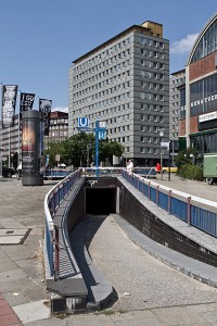
View of building D - ramp in foreground leads to a tunnel under Klosterwall which exits right in front of the building and also provides access to the subway station Steinstraße
Because the site is located on a slope, you can’t cross the passage from north to south without climbing stairs. There is a large staircase at the south end, which obviously at one time featured an escalator as well. Maybe it is still intact, but it is hidden under a wooden shed. Walking upstairs and along the passage, there are more, smaller staircases along the way. There are no elevators provided for disabled people, but you can go up the slope along Klosterwall or Johanniswall and enter the passage through any of the entrances on the east or west side.
A note on the facade: while it seems to be verified that the facade has at some point in time been replaced, there are varying stories about how the building looked before. While a Wikipedia article states that the original facade was darker than the current one, other sources claim that the buildings were originally clad in white tiles. I couldn’t find any historic photos that would clear things up, but the latter version is backed by the fact that white tiles can indeed be found at the various side entrances of the complex.
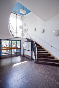
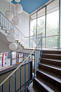
While I haven’t investigated the inside of the buildings, I still entered the lobby of building D, the southernmost building, whose lobby spans two-storeys and features a spiral staircase along a glass wall leading up to the first floor. On the northern wall there are two sets of elevator doors. The staircase is not free-standing as in one of the buildings at Grindelberg housing complex which was built a little earlier, but it shares a similar, typical 1950’s look. In the well hole, there are several large drop-lights with spherical lampshades. Going up the stairs you’ll realize that the ceilings of the first floor are rather low. Heading further up, you enter a very narrow and dimly lit stairwell, which is somewhat contrary to the open, airy feel that the lobby provides.Going back outside and into the passage, you’ll notice that it is mostly void of people and that the shops are either deserted or very shabby. It only gets somewhat lively on the outside of the complex at the front towards Klosterwall, where the shops have a bigger exposure due to the large street. This is one of the core problems of the complex: the passage is not used by pedestrians, making it hard for shops to survive there.
While the concept of offering pedestrians a quiet shopping passage away from the busy street seems agreeable, it is possibly the location of the entire complex that causes the concept to malfunction. You can’t help but realize that the area immediately south of busy Mönckebergstraße – one of Hamburg’s main shopping streets – feels a little like the backyard of the city. There you will find the old office building district (including architectural gems such as Chilehaus, just a stone’s throw away from City Hof) which attracts many workers but few people willing to spend money. The same problem can be observed in City Nord, where numerous large corporate headquarters are located around a central shopping zone, which is equally deserted. City Nord was built in the 1960’s and grew from a decision to keep large company headquarters out of the already crowded city center. Before, Unilever headquarters at Gänsemarkt was built as a guinea pig, but it quickly showed that the workers would arrive by car or subway and disappear into the building in the morning and leave at closing time without frequenting the surrounding shops.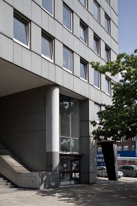
Outside Building D - Main entrance and large lobby window to the right. Stairs on the left leading up into the passage. Note the remains of a former escalator.
The relevancy of the axis between Central Station and Hafencity along which City Hof is located will be redefined though once Hafencity development reaches the area to the south. Klosterwall will become the main route for entering this part of Hafencity from the city center, and both motorized and pedestrian traffic will increase. This holds the chance to restructure the area and lead more pedestrian traffic through this corridor. And with that, the usage of the City Hof passage may increase. However, the complex may not be around long enough to prove this theory true: as part of the redevelopment of the area, City Hof is scheduled to be torn down and replaced by new buildings with probably a different concept. To those who care enough to take a close look at City Hof, it will be remembered as one of those very clear concepts of modern architecture and city planning which didn’t work out quite as well in reality as on paper.
* * * * *
See the full series of photos of City Hof in this flickr set.
