Nakagin Capsule Tower: The Unloved Icon – A Metabolist Masterpiece, now Threatened by Wrecking Ball

There are structures and buildings around the world that are universally recognized as landmarks. They are of architectural importance, cultural value and historic importance, and they are beautiful even to the architecturally untrained eye. As a result of these factors, these buildings are often landmarked. Some buildings though, while boasting many of these characteristics, do not succeed in raising enough concern to be protected. This is the bitter, though still open-ended story of one of them: The Nakagin Capsule Tower in Tokyo, Japan.

After World War II, Japan set out to recover from the extensive war damage and to claim its place among the industrialized nations. The rise of Japan was fast and brought far-reaching changes for both society and people’s individual lives. Like in any era of great upheavals, ways needed to be invented to deal with the new, emerging conditions. For Japan, as for all other industrialized countries, the recovery and rapid industrialization meant significant changes in the style of living: the traditional family life was eroded by the migration of young people to the big cities and the changes in the labor conditions. In this rapidly changing society, architects developed visions for future cities and the way people would live.

One of these Japanese groups of architects called themselves the Metabolists. Founded in 1960, their architectural concepts dealt with the rapid economical changes and their meaning for the people of Japan. They developed theories for new cities, cities that could adopt to the constantly, and ever faster, changing conditions. They developed flexible buildings, houses that could travel to another place with their inhabitants if needed, building complexes that could expand or shrink according to demand, cities that were sustainable, with buildings made of recyclable materials.

One of the leading members of the Metabolists was Kisho Kurokawa. He was also the first to turn the visions of the Metabolists into actual architecture. In his Metabolist work, he centered on flexibility utilizing ready-made parts, one of the central postulations of Metabolism. His first building utilizing these technologies, and one of the few realized examples of the Metabolist movement, is the Nakagin Capsule Tower in Shimbashi, Tokyo, finished in 1972.

In Metabolist architecture, a building is made up of two components: A long-living primary structure and a flexible secondary structure. The primary structure represents the “frame” of a building, to which the secondary structure is attached or removed as needed. The Nakagin Capsule Tower consists of two tower cores, 11 and 14 stories high and connected by bridges at various levels, and 140 capsules which are attached to the towers using a sysmtem of high-tension bolts.

The base of the building features the lobby as well as a convenience store. From this base, the two towers rise, executed with a steel frame and reinforced concrete. This part of the tower was built on-site. The capsules on the other hand were prefabricated at a factory and are made of lightweight, welded steel. They are based on the concept of shipping containers which was developed in the 1950’s by the US army and later modified for civil use. The capsules measure 4 x 2.5 x 2.5 meters and feature a bed, bath room, desk, TV, radio and tape deck. At the far end of the capsule, opposite to the entrance door, is a large, round window. The original concept provided the possibility to join multiple capsules in order to create a larger living space, but this option was never executed.

When it was built, the Nakagin Capsule Tower served as a hotel for “salarymen”, which is the Japanese term for white-collar workers. Today it is used as a residential building. However, since its construction 37 years ago, the building has not been maintained and is slowly deteriorating. The capsules had originally been designed to last for 25 years and be replaced afterwards. This way, the living spaces would be constantly modernized, while the primary structure was built to last. However, this replacement of the capsules never happened and today the entire tower has fallen into disrepair. The constant stress has damaged the bolts that fasten the capsules to the towers. The roofs have leaks and the concrete of the towers crumbles. Adding to these circumstances are concerns of the residents about the possible use of asbestos in the tower. In 2007, the residents voted to demolish the building and have it replaced by a modern residential tower, which would provide better living conditions and larger apartments. The Nakagin Capsule Tower stands in a high-value area next to the famous Ginza district in central Tokyo, so it would be profitable to destroy the building and replace it with a new tower, which would also make more economical use of the site area.

If the Nakagin Capsule Tower is demolished, it will not be the first Metabolist building to disappear: a second capsule tower by Kurokawa, the Sony building in Osaka, built in 1976, has already been demolished a while ago. Kurokawa tried to prevent the same fate from striking the Nakagin Capsule Tower, his first, original capsule creation, suggesting that all 140 capsules be removed and replaced with new, modern capsules. This plan was supported by several architectural associations of Japan, but has not been put into action. A claim to the UNESCO to file the building as world cultural heritage was unsuccessful. Finally, Kurokawa even intended to buy the building and the land it stands on from the American hedge fund that owns the tower.

But then Kisho Kurokawa died of heart failure on October 12, 2007.

Currently, a developer to demolish and replace the building has not yet been found. This fact can probably be attributed to the current dismal state of Japan’s economy.

The future of the building is unknown. Until one or the other group can push its interests through, the building remains in a state of uncertainty. So far, no public interest in preserving the building has been expressed. It is probably the unusual (some might say “ugly”) look of the building and the fact that it belongs to a generally unloved kind of post-war architecture that has hindered people from being able to connect with this piece of architecture. And the Japanese way of dealing with outdated architecture, whether it’s just visually out of date, technically outdated or functionally obsolete, might just be different from the way the western countries cradle their historic landmarks. In a country with as little inhabitable space as Japan (70% to 80% of the country are mountainous), landmarked buildings, especially if they have lost their original function and are mere museum objects, take up valuable space that could be used in a more efficient way. In shintoism and buddhism, Japan’s two main religions, the cycle of life and death is an essential characteristic. It is symbolized, for instance, by the cherry blossoms in spring, which display their fragile beauty only for a few days before they vanish. Maybe this perception translates to other parts of life as well, such as architecture.

The Nakagin Capsule Tower is a kind of building that doesn’t reveal its beauty to the passer-by, or the architecturally uninterested person in general. The building does not have a facade in the traditional sense. With the repeating cubic volumes of the capsules attached to it, it resembles an organic structure. Its beauty is peculiar and stems from its architectural and cultural meaning, from the fact that it is a built expression of the conditions and ideals of its time. Even though these ideals have not taken their place in society in the end, and society has moved on to other forms of urban living, it is still an example of a brilliant theory, a fragment of an experimental, avant-garde architecture that tried to offer new solutions for urban living in a time that required them. In this respect, it has architectural as well as historical and cultural significance and thus should be worth protecting. What about renovating the building and converting it back into a hotel, just like it was originally intented for? Capsule hotels are still popular in Japan, so there could be a market for the building as a hotel, especially in a location as central as Ginza/Shimbashi. If the current owners of the building do not intend to save it, selling it to a hotel operator that has the intentions to preserve the historical architecture and turn it into a profitable hotel might be a good solution.

In the July 7, 2009 issue of the New York Times, an article by the paper’s architecture critic Nicolai Ourousoff portrayed the Nakagin Capsule Tower and its fate. He sums up the architectural importance of the building as follows: “The Capsule Tower is not only gorgeous architecture; like all great buildings, it is the crystallization of a far-reaching cultural ideal. Its existence also stands as a powerful reminder of paths not taken, of the possibility of worlds shaped by different sets of values.” He concludes the article stating that the destruction of landmarks like the Nakagin Capsule Tower and other buildings of similarly high value and low public and political interest is “not only an architectural tragedy, it is also a distortion of history”.

It remains to be seen whether the wind for Nakagin will change or whether economical decisions will seal the fate for this prime example of post-war intellectual Japanese architecture.

Sources:
“Future Vision Banished to the Past”, The New York Times, July 6, 2009, accessed July 13, 2009
“Nakagin Capsule Tower”, Wikipedia, accessed July 13, 2009 (http://en.wikipedia.org/wiki/Nakagin_Capsule_Tower)
“Japan”, Wikipedia, accessed July 13, 2009 (http://en.wikipedia.org/wiki/Japan)
Andreas Lepik, “Wolkenkratzer”, Prestel, 2005
Goodbye TVCC

Rem Koolhaas’ TVCC building under construction in Beijing burned down on Monday and was practically renderered unusable.

The TVCC building in Beijing, adjacent to the already famous CCTV headquarters building, caught fire on Monday and was almost completely destroyed. The building was still under construction and was supposed to be occupied by a hotel and cultural facilities. It was designed by Rem Koolhaas’ office OMA, who also designed the main CCTV building (which obviously was unharmed by the fire). TVCC was one of my most favorite current skyscraper designs due to its unique irregular geometric form. Plus, it made a visually convincing companion to the CCTV building next to it. It is deeply saddening to see it burn down like this. The disaster, which took place on the last day of the Chinese New Year celebrations, when the city was engulfed in fireworks, is considered a bad omen for the new year by many witnesses.

Photos at Stern.de
Article at The New York Times Online (with video and audio commentary)

In a City of Bygone Glory, a New Chapter of Drab Architecture

The development of New York’s biggest spot of open land seems to turn into another urban planning failure.

On Wednesday, March 26th, real-estate company Tishman Speyer was selected by New York’s Metropolitan Transit Authority to develop the Westside Railyards, a 10.5 hectares (26 acres) industrial area on the west side of Manhattan. The decision followed a lengthy process in which five companies competed for this biggest patch of undeveloped land in Manhattan, which is about twice the size of Ground Zero. Ironically, the final decision was not based on the best urban vision for the area, but because the other four contenders dropped out of the race because of a lack of funds to subsidize the project due to the current financial crisis.

If you thought that architecturally, it couldn’t get any worse than the final plans for Ground Zero, then you’ll realize that the situation now has obviously bottomed out. The towers designed by Murphy/Jahn are completely unimaginative blocks whose only creative aspect is that they come in sets of two which are rotated 180 degrees to each other. The high-rise buildings flank the north and south sides of the area and cut it off from its surroundings, creating a canyon that does not integrate into the surrounding neighborhood in any way. This is as unimaginative as it gets, and this is what you get from a developer that wants the most bang for the buck as has no aspirations to create a stimulating urban environment.

In the past years or decades, New York has had its fair share of mislead urban planning projects. The redevelopment of Ground Zero has become the city’s most discouraging project after the developer chopped off more and more aspects of Daniel Libeskind’s original masterplan, turning the ambitious plan into nothing but money matter and run-of-the-mill architecture, and degrading the foregoing architectural competition into nothing more than a public show. in Brooklyn, the Atlantic Yards project, developed by architect Frank Gehry, is in the midst of being shrunk to a shadow of its former self, due to a lack of funds.

It looks like New York, boasting the famous and, at it’s time, trend-setting large scale development project Rockefeller Center, uses any chance it can get today to screw up contemporary projects of similar sizes. The plans get severely diluted, and the architecture ends up as something that shows no intention of setting new standards and doesn’t even seem to care about its role in this city that once was famous for its architecture.

Maybe there is a slight chance of hope though. Maybe not for Ground Zero, which already (though that word sounds so totally ironic in this context) is in the process of construction. But for the Hudson Yards, there are still countless years of planning ahead. With a lot of luck, there will be a shift in the plans until then, and the architecture might change as well during the process, as it is not carved in stone yet, so maybe it will change to the better. But much more important is that after all these painfully mislead projects, New York and its developers finally have to realize their failures and change their way of thinking and — this has to be said — shift their priorities from pure financial aspects towards a sense of responsibility in respect to the city and its inhabitants. They are constructing the New York of tomorrow, and they have to make sure the future New York lives up to the fame that the old New York had. And I express this hope even though “recent history teaches us […] that the project is only likely to get worse”, as written by New York Times’ architecture critic Nicolai Ouroussoff in this article.

(I was tempted to also mention the horrid project of a developer to turn a 1920’s building’s brown brick facade into a glass curtain wall, but that is a different story and it doesn’t fit into the scale of the projects described above, even though it still shows how ignorant some developers are in respect to the historical substance of the city. So if you want another dreadful story, read this article)

O For Hafencity

Acclaimed Dutch architect Rem Koolhaas places an O at the Elbe shore, in form of a building to house the new Hamburg Science Center in the upcoming Hafencity district.

Last Monday, Dutch architect Rem Koolhaas, head of the Office for Metropolitan Architecture, presented his revised design for a building to house the Science Center, to be situated at the waterfront at Hamburg’s Überseequartier district, part of the Hafencity development which is currently under construction. Sadly, I couldn’t make it to the presentation myself, so I have to rely on information from newspapers and the press release at the OMA website.

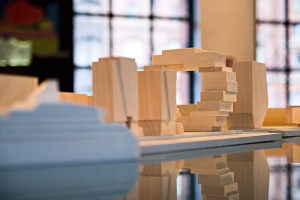
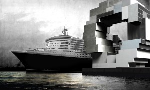
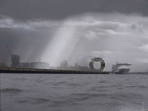
The previous design by Koolhaas, which won the competition for the building in 2004, looked like an amethyst, with a round back, flat front and a hole right in the middle of the building, as seen on this photo at the bottom right of the display. This hole is pretty much everything that remains of this concept. The new building looks like a bunch of stacked containers forming something that resembles a huge letter O. According to Koolhaas, he was inspired by the harbour and the huge container terminals.

At a height of 70 meters, the Science Center will be among the taller buildings in the new Hafencity district, creating an iconic landmark right at the waterfront, though located far enough from the Elbe Philharmonic Hall as to not interfere with this most ambitious building in the new borough. The Science Center will house a science park, aquarium, shows and laboratories that will illustrate scientific relationships by use of different media and a “do it yourself” experimental park.

The presented design and illustrations are still somewhat rough, making it hard to imagine how the final building will look like. For example, there has not yet been a decision on the materials for the building’s facade. The hole in the very middle of the building is not a new concept from OMA. The most notable example is their CCTV building currently under construction in Beijing for China Central Television – a skyscraper which winds dramatically around a central void, with two slanted towers and a breathtaking overhanging section that connects those towers to form kind of an endless loop. Though not yet finished, the building is already considered an architectural icon of the early 21st century. The design for the Science Center will surely not reach such high acclaim, but it could prove to be a distinctive and memorable addition to the skyline of a newly forming borough.

(Illustrations by OMA)

The BIG Picture

Copenhagen-based architectural office BIG has a pretty unique approach on architecture and urban plannuing. I hope their Scala Tower in the heart of Copenhagen gets built, as this building alone would justify another visit to the city (hoping that next time we don’t have stuff stolen from our tents at night) – watch the video on page 64 of the presentation located behind the item SCA in 2007 on the BIG website.

Their website doubles as a game of Arkanoid. For easiest access choose “programmatic” from the menu and then locate the item ARK under “media”

At Louisville, Museum Plaza Taking Shape

Louisville, Kentucky, USA is most probably not a city that’s on the radar of many people. The city of roughly 700.000 inhabitants located at the Ohio River is hardly known outside the US. This might change though, at least for people who are interested in architecture, since the city is the site for what is probably one of the most polarizing current architectural projects, “Museum Plaza”.

Originally planned as a new art museum and art center, it became soon clear that a fairly large selection of other uses for the building would be needed in order to come up with the running costs of the complex. In the end, it was decided to build a mixed use 62-story skyscraper including luxury condos, offices and a hotel besides the main art space. Since the contraints of the building site were very difficult, the New Yorker architectural office REX (led by Joshua Prince-Ramus, who was once a partner of Rem Koolhas at OMA) had to turn usual architecture standards upside down, in the truest sense of the word.

REX’s project website shows an (at first sight) somewhat ugly and non-proportional building. It takes some time and explanation to get behind the idea of this building and see why it’s special and what makes up the actual concept. And that concept is explained by Joshua Prince-Ramus at TED TALKS, the video of which can be seen at the company’s website. Prince-Ramus talks about three different projects, Musum Plaza is the last one, about two thirds into the video. The solution of lifting the public parts of the building way up into the air becomes clear as he talks about the constraints and circumstances of the project. From this perspective, the clumsy building seems to fulfill its intention and will also provide a new architectural landmark that will probably give a boost Louisville’s reputation (at least, I would like to see that monstrous building in person).

The video and presentation finishes with an animation about Museum Plaza that is very well worth seeing, even if you’re not interested in the architecture itself. The way the video was filmed and the way it seamlessly combines shaky hand-camera filming with rendered and animation sequences is breathtaking. If you don’t want to load that whole video to see this, you could also see the video at YouTube, albeit with a much worse quality.

A Trip Through the History of a Capital

There are places that are of such historical significance that it makes you hold your breath and contemplate. Berlin is such a place. The city has played a vital role in many of the worldwide political happenings of the 20th century, and has been the place of both unbelievable sadness as well as boundless joy. The cruel, inhuman regime of the Nazi, the splitting of the country into the Federal Republic of Germany and the German Democratic Republic, the cold war, the fall of the Berlin Wall, reunion of Germany and the crumbling of the Eastern Bloc – Berlin was often right in the center of the events that marked the 20th century.

When you stroll through the city today, these historical traces can still be witnessed in many places. The markation line of the former Berlin wall runs through the city, with original remnants of the wall being visible in some places. Museums decicated to the devision of Berlin and Germany can be visited and provide a shocking glimpse into the life on both sides of the wall between 1961 and 1989. There are places of interest at former border crossings, most famously the “Checkpoint Charlie” at Friedrichstraße. In the eastern part of Berlin, you can still see countless traces of the former GDR, in architecture, sculptures, remnants on literally every street corner. Travelling through the city is like travelling through German history.

And then there is the new Berlin. After the reunion, and especially after Berlin has become the German capital in 1990, the face of the city changed drastically, and still continues to do so. In many cases, the new developments refer to the city’s split past. The impressive row of buildings in the new parliament district – just north of the renovated Reichstag with it’s new glass dome – form a line called “Band des Bundes” (“Ribbon of Government”), which crosses the river Spree twice, and in this crosses the former border between East and West Berlin which was located along the river at this place, thus symbolically linking both parts of the city – and Germany.

At Potsdamer Platz, just a few blocks south of the parliament district – passing by the famous Brandenburg Gate and the exceptional new “Memorial for the Murdered Jews in Europe” – an entirely new quarter was built right on the former border. During the splitting of the city, this area was a no man’s land between East and West Berlin. After the reunion, a new quarter arose from these fields, which today forms a new city center and attracts countless people each day – inhabitants and visitors alike. Impressive high-rise buildings gather around the large plaza, on which the former line of the Berlin Wall is marked.

Despite the cosmopolitan atmosphere and all the new developments that are happening, you can still feel the spirit of a difficult century in Berlin. Walking through the city, especially when you pay attention to the signs and remnants of the past and learn from the information provided at key points, you just can’t help feeling a bit dizzy from everything that this city has gone through. And this key to the Berlin experience: A visit to the city is a trip into the past of this country, and you take home something a lot more valuable than the usual holiday impressions (and sounvenirs): A free lesson in history and a deep insight into the past century.

All content © by Tobias Münch.
On Architecture – A Kotogoto Project