Frankfurt, Germany

The skyline of Frankfurt, Germany as seen from the Flößerbrücke bridge. Frankfurt is unqiue for being the only German city with skyscrapers. The city is is a global financial center and most of the towers house the headquarters of German as well as international banks.

Photo © Tobias Münch

See the photo on flickr

New Residential Development on Grindelberg

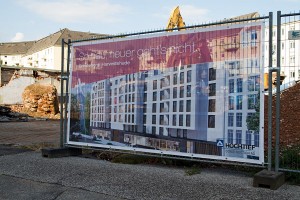
View of the construction site on Grindelberg

In July we saw the sad outcome of the referendum concerning the Hoheluftkontor in Hamburg, where NIMBYism averted the construction of a building on a site next to Hoheluftbrücke subway station, but now there are some positive developments just 200 meters southeast of that site: Construction of a new residental building on Grindelberg will be underway soon. Located on the former site of an auto repair shop and a long-abandoned detached house (both buildings have been demolished by now), the seven storey building will extend the existing line of buildings that span the curve of the street.

Posters with renderings of the building have already been put up along the site fence (see the second photo on the right). They show a building with a relatively simple facade plastered in white. Several bays are pulled out of the facade towards the street, each stretching upwards for nearly the entire height of the building. Both of these design elements – white plastered facade and bays – reflect the facade of the building next door, making the new building a good continuation of the existing row of buildings. This is very sensitive design and contextuality at its best.

Poster with rendering of the building under construction

The row of buildings actually begins at the intersection of Grindelberg and Schlankreye with a Gründerzeit building sporting the typical ornamental facade, bays and gable fashionable at the time. The next building, a circa 1990’s development, retains the same architectural elements but simplifies them into a then contemporary language. Of special note is the gable, which looks massive when seen from the front of the building, but is really just a mock-up, anchored to the roof by metal beams, as can be seen from the side. The new building that is about to be built next to it gets rid of the gables in favor of a set back top floor, but retains the bays, white plastered facade and orientation of the windows. As this is a rather lively area, all buildings feature shops on their ground floors, something that I am happy to see present in the new building as well.

Although it relates closely to existing neighbors, the new building still manages to develop a distinct formal language by adding balconies at the bays, and those balconies are defined by irregular, golden handrails which look rather interesting in the renders. The same kind of lattice is used for the gates that lock the passages that allow cars to enter the parking lot in the backyard (or even an underground parking lot?). The ground level seems to be clad in some dark brick and featuring very wide shop windows with – again – golden frames. According to additional renders displayed on site, the rear side of the building, inside the block, will feature patios and gardens that will offer the residents a quiet refuge away from the busy street.

The building has been designed by young architectural office Schenk + Waiblinger Architekten, who have recently completed a very interesting office building on Domstraße in Hamburg’s Altstadt district – one of my favorite current buildings in Hamburg. Also, they have created a building right next to the Elbphilharmonie. Their residential building on Grindelberg seems promises to become another beautiful piece of work and I am looking forward to see it completed.

City Hof

City Hof - Overview

View of the City Hof complex from the south

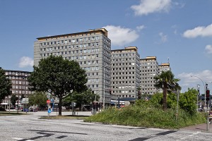
Situated between the Central Station and the exhibition halls Deichtorhallen, in close vicinity to Hamburg’s famous office building district of the 1920’s, you can find a complex of four high-rise buildings which were designed by Rudolf Klophaus and finished in 1955. These buildings called City Hof were the first high-rise buildings built in Hamburg after World War II and showcased the latest and most modern architecture.

Today however, times have changed and the buildings are generally regarded as an ugly remnant of the reconstruction of Hamburg and the economic miracle of the 1950’s and most people would be happy to see them demolished. Which is exactly what is about to happen. Once the current tenant, the district offices Hamburg-Mitte (Bezirksamt Hamburg-Mitte) moves to their new Hafencity home which is currently under construction, the plan is to taer down the buildings and open the area for redevelopment in order to provide a better connection between the inner city and the new Hafencity district. Due to the use of asbestos in the buildings (the facades for example are clad in gray fibre cement panels which contain asbestos), a rehabilitation of the complex would become very expensive. And since the City Hof buildings are not considered to be outstanding architecture (there has been an attempt to put a preservation order on them, which failed), they will be gone soon, and it doesn’t seem like they will be missed.
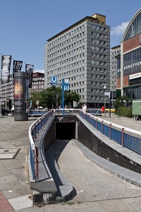
City Hof

View of building D - ramp in foreground leads to a tunnel under Klosterwall which exits right in front of the building and also provides access to the subway station Steinstraße

You still have to appreciate the architectural concept though. The complex consists of four high-rises with 12 (buildings A, B, C) and 13-storeys (building D), standing on a nearly exact west-east axis, slightly offset against each other due to the course of the road Klosterwall. Lower two-storey sections connect all buildings. While these look like a solid body from the outside, they are actually comprised of two rows of buildings that leave a north-south passage in between which runs through the entire complex. At regular intervals, openings to the east and west provide additional permeability, so the passage can be entered from any side. The passage is lined with small shops and was actually one of the first shopping passages in Hamburg, many of whose today define the commercial center of the city. The complex also includes a parking lot and a small auto shop.

Because the site is located on a slope, you can’t cross the passage from north to south without climbing stairs. There is a large staircase at the south end, which obviously at one time featured an escalator as well. Maybe it is still intact, but it is hidden under a wooden shed. Walking upstairs and along the passage, there are more, smaller staircases along the way. There are no elevators provided for disabled people, but you can go up the slope along Klosterwall or Johanniswall and enter the passage through any of the entrances on the east or west side.

A note on the facade: while it seems to be verified that the facade has at some point in time been replaced, there are varying stories about how the building looked before. While a Wikipedia article states that the original facade was darker than the current one, other sources claim that the buildings were originally clad in white tiles. I couldn’t find any historic photos that would clear things up, but the latter version is backed by the fact that white tiles can indeed be found at the various side entrances of the complex.
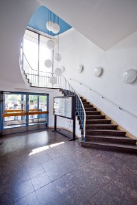
City Hof Building D - Lobby

Inside the lobby of building D

While I haven’t investigated the inside of the buildings, I still entered the lobby of building D, the southernmost building, whose lobby spans two-storeys and features a spiral staircase along a glass wall leading up to the first floor. On the northern wall there are two sets of elevator doors. The staircase is not free-standing as in one of the buildings at Grindelberg housing complex which was built a little earlier, but it shares a similar, typical 1950’s look. In the well hole, there are several large drop-lights with spherical lampshades. Going up the stairs you’ll realize that the ceilings of the first floor are rather low. Heading further up, you enter a very narrow and dimly lit stairwell, which is somewhat contrary to the open, airy feel that the lobby provides.

Going back outside and into the passage, you’ll notice that it is mostly void of people and that the shops are either deserted or very shabby. It only gets somewhat lively on the outside of the complex at the front towards Klosterwall, where the shops have a bigger exposure due to the large street. This is one of the core problems of the complex: the passage is not used by pedestrians, making it hard for shops to survive there.
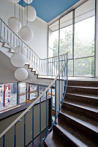
City Hof - Inside the Lobby

Heading up the spiral stairs along the large window

While the concept of offering pedestrians a quiet shopping passage away from the busy street seems agreeable, it is possibly the location of the entire complex that causes the concept to malfunction. You can’t help but realize that the area immediately south of busy Mönckebergstraße – one of Hamburg’s main shopping streets – feels a little like the backyard of the city. There you will find the old office building district (including architectural gems such as Chilehaus, just a stone’s throw away from City Hof) which attracts many workers but few people willing to spend money. The same problem can be observed in City Nord, where numerous large corporate headquarters are located around a central shopping zone, which is equally deserted. City Nord was built in the 1960’s and grew from a decision to keep large company headquarters out of the already crowded city center. Before, Unilever headquarters at Gänsemarkt was built as a guinea pig, but it quickly showed that the workers would arrive by car or subway and disappear into the building in the morning and leave at closing time without frequenting the surrounding shops.
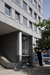
City Hof - Outside Building D

Outside Building D - Main entrance and large lobby window to the right. Stairs on the left leading up into the passage. Note the remains of a former escalator.

At the City Hof passage, there are only a few specialized shops that are able to succeed under these circumstances, like a large Asian supermarket which has its customers coming from far away throughout the city. The rest of the shops, like travel agencies and kiosks, seem pretty shabby. Shops that depend on a continuous stream of pedestrians cannot succeed in this environment, as it seems.

The relevancy of the axis between Central Station and Hafencity along which City Hof is located will be redefined though once Hafencity development reaches the area to the south. Klosterwall will become the main route for entering this part of Hafencity from the city center, and both motorized and pedestrian traffic will increase. This holds the chance to restructure the area and lead more pedestrian traffic through this corridor. And with that, the usage of the City Hof passage may increase. However, the complex may not be around long enough to prove this theory true: as part of the redevelopment of the area, City Hof is scheduled to be torn down and replaced by new buildings with probably a different concept. To those who care enough to take a close look at City Hof, it will be remembered as one of those very clear concepts of modern architecture and city planning which didn’t work out quite as well in reality as on paper.

* * * * *

See the full series of photos of City Hof in this flickr set.
Hoheluftkontor Averted by the Vox Populi

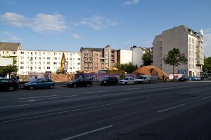
A view of the current condition of the site. Straight ahead is the Mc Donald\’s restaurant, behind it to the left is Hoheluftbrücke subway station and to the right the empty lot.

There is a place next to Hoheluftbrücke subway station in Hamburg which consists of a small building with a fast food restaurant inside and some unused land behind it stretching for some 50 meters along the subway tracks (this lot actually holds a bomb shelter). In 2007, an investor made plans to demolish the restaurant and build an office building (they called it “Hoheluftkontor”) on the site (which as a side note would again include space for the same fast food restaurant). They also wanted to create a square in front of the building with a café next to the Isebek canal.

The building was planned to have six storeys that would raise out of a cubic-shaped base and which would then step back irregularly and form a kind of tower on the side facing the main street, Hoheluftchaussee. Thus, it would provide a counterpoint to the tower of the historic “Klinker” building on the other side of the subway tracks, creating a gate through which the subway would run. The building would be clad in red brick in a nod to local building traditions.

The project however soon faced opposition from an initiative that was concerned about the natural landscape along the canal, which might get partly destroyed by this “monolithic building”, as they put it.

After some discussions between the disctrict administration and the initiative, a compromise was offered, which included the reduction of the building height by one storey and abandoning the plans for the riverside café. The initiative did not accept this compromise and requested a referendum. Things started to heat up in the following time, with both parties slashing each other’s claims and actions.

In the end, it was hard to make out the facts from the massive amount of agitated rhethoric. Even for people who tried to stay informed about the project, it became hard to sort out the facts wihout getting swept away by propaganda from both sides (as a matter of fact, I am finding it very difficult to write this article and decide which facts to include and which to omit. The whole story if far more complex than I can reproduce here).

In my opinion, most of the facts stated by the initiative seemed very shallow and wouldn’t stand an in-depth examination. In fact, the only claim worth considering that I noticed was the traffic situation: leading the traffic for the office building through the surrounding network of quiet residential streets would lead to an increase in traffic and thus of traffic noise, and would aggravate the problem of finding a parking lot in this notoriously crowded area. It’s not that the office workers couldn’t get to work by subway, you could literally jump from the station into the building and vice versa since it would be located directly adjacent to the station. But many people probably would still prefer to drive to work in their car.

The referendum was finally held on July 1st. With a voter turnout of only 23,34%, 68,66% of the voters voted against the building. I was somewhat irritated by the low turnout, but then a phone call with my parents gave me a key to understanding the situation behind the results. My parents live in another borough some kilometers north of the site in question, but since it belongs to the same district, they would be eligible to vote. On the phone, my father said to me “We got a letter concerning this referendum. We threw it away. What do we care about some building to be built down there.” Thinking about it, this might be exactly the reason why this vote ended up the way it did: most people just don’t care about voting for or against some building somewhere in town (there’s a vast number of buildings being built in the city at any time after all), unless they happen to live right in the neighborhood. And in the neighborhood, the initiative did its work well. Add to that a generic “all new things are evil and everything in our little world should stay as it is” attitude and you’ve got a good chance to turn down any project in question. But even if you are not completely dismissive, it’s hard to get all facts sorted out and make up your mind about the topic. After all, why spend your time researching on the topic in order to come to a decision if the only way you will ever deal with the building is when you drive past it on your way into town? Why fight your way through the semi-facts that both parties throw at you when its blatantly obvious that both parties are trying to convince you with agitated rhethoric instead of useful facts? It’s just a building, it’s not worth the hassle. People have better things to do than worry about some random construction project somewhere in town.

In this respect, it becomes obvious why so many supporters of the initiative cast their vote: because they were the only ones who cared. This raises questions about the reasonableness of referenda. Although they may at first seem to be the most democratic solution for confrontations like these, an imbalance is created in reality between the creators of the initiative, who work hard for their interests to be considered, and the general people to whom the referendum is meaningless and who thus don’t cast their vote.

With development of this place averted by the vox populi, the lot will – for now – stay just as it was. The initiative aims to have a public park built on the site, but the borough administration already turned that idea down, saying that a park is out of question and had always been during the discussions. So for now, Hoheluft residents will have to continue living with an undeveloped lot that continues to attract shady types and does not provide am enjoyable public area.

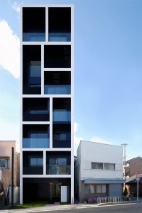
Standing Tall: Apartment in Katayama by Mitsutomo Matsunami

Apartment in Katayama by Mitsutomo Matsunami, photo © by © Mitsutomo Matsunami

Architecture and design blog “What we do is Secret” has a great series of articles about a fantastic apartment building in Katayama, Japan by architect Mitsutomo Matsunami. Despite (or because of) the fact that the building blatantly ignores the context of its surroundings, its elegant facade and stylish architecture make it a joy to look at. And while one may argue that the project is designed to squeeze every available square meter out of its ridiculously small site, you cannot deny that it does this with incredible style.

See a list of the articles about this building at “What we do is Secret”.
Architect’s website: http://www.mma-design.com/

Photo by Whatwedoissecret / © Mitsutomo Matsunami

Berlin Without a Castle

As part of an austerity package which has been accounced today, the German government has put the (re)construction of the “Berliner Stadtschloss” on hold until 2014, which essentially means that the project has been cancelled, or is at least likely to be cancelled in the end. The original plan was to reconstruct a former Prussian castle which once inhabited a site in the center of Berlin, but had been damaged in World War II and was demolished during the period of the German Democratic Republic.

The Stadtschloss was one of the most controversially discussed current architectural projects in Germany, a fact which echoes in the media reception of today’s annoucement. While the Spiegel weeps for the “most important project in the country”, Baunetz agrees with the decision and infers that “a fiscally wrong argumentation leads to an architecturally right solution” (both articles available in German only).

Even after its presumable death, the project will probably continue to spark endless discussions in the architectural world.

Previously Released Posts Below

Please note that all posts older than this one have been previously released on my blog at Kotogoto and have been migrated to this blog.

Evaluating Architecture Through its Historical Background — Berlin’s White City

When dealing with architectural heritage from any age, it is essential to highlight its historical background in order to understand the object that you are observing. No architectural project or urban planning theory stands isolated. Instead, they are all a result of the circumstances of their time: trends in architecture and urban planning are joined by political circumstances and social visions that were formulated at the time. I was reminded of this fact during a visit to one of Berlin’s cultural heritage sites, the “White City”.

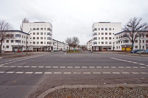
White City: Looking north along Aroser Alle

When I was in Berlin in February, I visited the White City (“Die weiße Stadt”) in Berlin-Reinickendorf, a housing complex built between 1929-1931. The White City is one of six large scale housing projects built between World War I and World War II that have been enlisted on the UNESCO World Heritage List in 2008: Gartenstadt Falkenberg (“Garden City Falkenberg”), Siedlung Schillerpark (“Schillerpark Housing Complex”), Hufeisensiedlung (“Horseshoe estate”), Wohnstadt Carl Legien (“Housing City Carl Legien”), Großsiedlung Siemensstadt (“Large Housing Complex Siemensstadt”) and Die Weiße Stadt (“The White City”).

All of these housing projects are answers to a severe problem in Berlin after World War I: the shortage of housing space. At the same time, urban planners were proclaiming a new vision of urban living: in reaction to the prevalent type of housing of the time — tenements where a great number of working class people lived in cramped spaces, often without sufficient access to daylight and under insanitary conditions — they formulated urban planning paradigms that aimed to offer space and air to everybody.

The city administration provided funding and passed laws that allowed (and even enforced) the construction of large scale housing projects that were based on these new planning principles. In this manner, a massive amount of over 140.000 housing units was built in the years between 1919 and 1930. The aforementioned housing complexes that were recently enlisted by the UNESCO are key projects in early modernist urban planning and architecture. They provided a blueprint after which countless similar housing projects in Germany and Europe were modeled.

When I visited the White City though, I didn’t know most of the historical information that I explained above, and the housing complex didn’t really impress me. At first, I was about to blame it on the bleak winter weather, but then I realized that I probably lacked important information which prevented me from pinpointing the underlying logic and core features of the complex. Without a proper background, my impression of the White City remained undefined and superficial. Back home, I did a search for books on the topic and ended up with “Siedlungen der Berliner Moderne” by Markus Jager, Jörg Haspel and Annemarie Jaeggi (eds.). After an introduction which explains the historical background and the urban planning theories that were prevalent at the time, the book presents each of the aforementioned six housing complexes in detail.

The White City is built around a central north-south axis, Aroser Allee (see map). The south entrance is marked by two tall “Gate Houses” (Torhäuser) designed by Bruno Arends, which step out of the row of facades along the street and reach out above the pavement. A few hundred meters north, the center of the complex is represented by the Bridge House (“Brückenhaus”) by Otto Rudolf Salvisberg, which crosses Aroser Allee and features loggias one one side and open corridors with the apartment entrances on the other – in it’s function as the center of the complex, it had to have two “front sides” and no backside.

The Bridge House also serves as the point that divides the different parts of the complex, all of which were designed by individual architects: the buildings south of the Bridge House, including the Gate Houses, were designed by Arends. The Bridge House itself and the buildings north of it were designed by Salvisberg and the radially arranged rows of buildings to the east of the Bridge House were created by Wilhelm Büning. Inbetween all buildings there are green spaces with parks and gardens – providing this kind of common space this is one of the central aspects of these theories of housing development.

Of course, time always leaves its mark on buildings, but I was surprised about the slightly neglected appreance of the complex. Only the facades along Aroser Allee were painted bright white. In the backyards and side streets, the buildings were grey. A lot of the elements like doors and windows are obvisouly still in their original state with little modernization done over the years and therefore look a bit shabby.

This state of lacking preservation may be another reason why I wasn’t entirely impressed by the White City. However, had I known more about the background and history of the complex and the theories behind the housing developments of the inter-war years, I would have appreciated the complex in a completely different way. And thus, this is the lesson that I took with me after leaving Berlin: in order to value and appreciate the architecture of the past, you have to be informed about its history and the social circumstances that lead to its creation. There’s a lot to learn from historical architecture, but it takes more effort than simply looking at buildings.

Chop Off That Top! How to Turn Manhattan Into an Architectural Museum

Jean Nouvel’s proposed tower next to the Museum of Modern Art in New York was one of the most promising buildings to rise in Manhattan in the next years. Now, New York’s City Planning Department knocked the building into shape due to doubts concerning its architectural excellence.

New York is having a tough ride. After a long time of architectural blandness, the excess of the years before the current credit crisis blessed the city with some fairly innovative and beautifully modern building proposals. When the crisis reached its peak though, many of these sketches were away for financial reasons. One example for this is Herzog and de Meuron’s Jenga-style glass tower. Others barely survived the credit crunch: Frank Gehry’s Beekman Tower is under construction — albeit modified for a smaller budget — and is turning into a massive building that will redefine the Lower Manhattan skyline.

And what cheer went through the architectural scene when Pritzer price winner Jean Nouvel revealed his plans for a 75-storey building at 53rd street, right next to the Museum of Modern art (which would actually use some of the buildings’ floors to expand its exhibition space). The tower slopes back dramatically as it soars into the sky, supported by a network of irregular steel beams, the glass facade flush with the steel. The building would have reached a height of 381 meters, teh height of the Empire State Building without its spire. The proposal had the power to become New York’s next architectural icon, on par (not just in size) with giants like the Empire State and the Chrysler Building. But this is obviously something that not everybody was happy with.

On Wednesday, September 9, New York’s City Planning Department rejected the proposal and demanded that the building be cut by 61 meters (200 feet). According to city planning commissioner Amanda Burden, the building (or its top) does not meet the aesthetic standards that would be necessary for a building that wants to compete with New York’s most famous landmarks.

This instantly reminded me of Hamburg’s mentality towards modern high-rise architecture. Somewhere in the 1960’s, after the first huge corporate office buildings had been built in the inner city (the Unilever building at Gänsemarkt had been a kind of guinea pig), the city administration came to the conclusion that no building in Hamburg should compete with the main churches that define the city’s skyline. This has become a rule that exists until today. With its decision to restrict the height for Nouvel’s tower, New York has arrived where Hamburg had been in the 1960’s. For New York nowadays, the Empire State and the Chrysler resemble Hamburg’s churches — fixed points on the skyline that may never be matched or exceeded by modern architecture. In this, New York, the classical city of skyscrapers and the city that embodies the constantly changing and growing urban environment, seems to finally put an end to its strive for architectural greatness in order to freeze its skyline in time, turning its buildings into artworks in an urban museum that shows how the city looked in its golden years, yet closes itself to new architectural influences.

What’s unusual in the Planning Departmernt’s decision is that they obviously didn’t even ask Nouvel to rework his proposal to better fit its location. They criticized the top of the building, but gave Nouvel no chance to fulfill their demands by reworking the spire. Instead presented Nouvel with a fait accompli. This might lead us to the conclusion that there might be forced trying to stop the building from being erected. It’s not clear whether the action was sparked by a kind of NIMBY initiative or other people. What seems clear though is that the design for the building will see some massive changes that might affect its overall stature. Since this is not your regular building, but one of the most promising current projects in Manhattan, the sad conclusion is that New York in the present time cringes from redefining itself, like it has done so often before.

Further reading: Off With Its Top! City Cuts Tower to Size — The New York Times, September 9, 2009

The High Line is a Highlight

A disused elevated railway viaduct in New York City was recently turned in a remarkable park and public space.

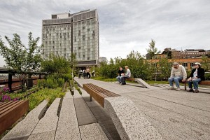
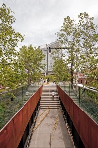
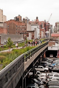
The High Line is a new park on an abandoned elevated rail track whose first stretch, from Gansevoort Street to 20th Street, has been opened at the beginning of June 2009. For decades, the rail viaduct lay unused and derelict, with the occasional photographers and other curious people climbing it for an adventurous stroll along a linear jungle surrounded by a jagged urban landscape. The idea to turn the viaduct into a park started to grow from just a few people to a community of interest, and was finally presented to the city. For New York, the idea came at the right time, since it is currently trying to breathe new life into the long-neglected west side of Manhattan, a landscape of parking lots, rail yards and an exhibition center that never attracted any noteworthy businesses in its trails. While the meatpacking district, once an agglomeration of butcheries and a redlight district, managed to turn into a super-hip area with designer shops and model clientele, the rest of the west side still lay in hibernation. Part of this is caused by the lack of transportation. While the Meatpacking district can be reached with a short walk from the station at 14th Street, there are no subway lines on the far west side of Manhattan, the system was never extended past Times Square and 8th Avenue. As part of several big infrastructure projects, the number 7 subway line is currently being extended westward from Times Square to tap the west side.

In this climate, the High Line park will certainly act as a catalyst, drawing people to the west side and, in the long run, attract new businesses and residents. The gentrification of the area is already underway, and will gain additional speed with the 7-line extension being finished.

The park itself can be described as one of Manhattan’s most interesing parks. This comes in part from the elevation: walking on the level of the second or third floor is certainly a new experience. Since there are no high-rises in the area, you can see across the rooftops towards Midtown, Lower Manhattan and New Jersey, which makes for spectacular views. The plantation of the park was chosen to mimic the wild plants that grew here during the High Line’s hiatus. The pathways are made from concrete and sometimes wooden strips that seamlessly fade into the planted areas. Benches spring up in one integrated, curvy motion from the ground. Other benches are placed on wheels on rail tracks (which the High Line incorporeates as a reminder of its past) and can be moved along the tracks. At one place, there will be a theatre-like slope of benches towards a glass window opening to the street, with the sitting space being directly above the street, so you can sit and watch the spectacle of traffic below.

The building on the first photo is the new hotel “The Standard” which opened in March 2009. It is suspended on concrete pillars above the High-Line and it’s currently the only new building in the area to be situated directly above the new park. Being located in the Meatpacking District, it is a hip location for an upscale design-conscious clientele. The building was praised by New York Times’ architecture critic Nicolai Ourousoff, but its building quality seemed sub-standard to me. The exposed concrete parts of the building are cracked and very porous and some materials look cheap. From the photos that I’ve seen though, the interior is exquisitly styled and probably makes up for the shabby exterior. Since the area is somewhat run-down anyway, and with build quality in New York being generally pretty low, the building might fit into the cityscape in the end. A few blocks north though and visible from the High Line, Gehry’s IAC headquarters and Jean Nouvel’s nearly-fininshed apartment building add shiny modern contrasts to the area. Other new glass buildings are under construction as well, giving the area a strange hybrid feel between old and new. It’ll have to be seen how the gentrification transforms the area in the end.

All content © by Tobias Münch.
On Architecture – A Kotogoto Project