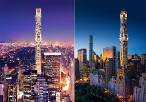
 This tower conceived by Mark Foster Gage Architects for New York’s “Billionaire’s Row” is apparently just a vision. But what a vision it is!
Read story at 6sqft
Read story at Curbed
View the project at the architect’s website
 This tower conceived by Mark Foster Gage Architects for New York’s “Billionaire’s Row” is apparently just a vision. But what a vision it is!
Read story at 6sqft
Read story at Curbed
View the project at the architect’s website
Danish architect wunderkind Bjarke Ingels has recently landed a couple of projects that justify the name of his architectural company BIG. While he has long reached far beyond his home country of Denmark, the commission to design a new building at 2 World Trade Center in New York City, which was revealed on June 9th, will finally put him onto the world map of architecture.
It will be his largest project to date, both in terms of height as well as the public exposure that building at this emotionally laden location brings along. In fact, one could say that there’s a generation change happening here. The former 2 World Trade Center design was created by British Architect Norman Foster, who just turned 80 this June. As an architect, he has arguably reached everything one could dream of. Bjarke Ingels on the other hand is half Foster’s age, 40, and still has plenty of time to catch up with him – and seems to have come quite far given his young age. The decision to hire him as the architect of 2 World Trade Center, replacing Foster, is in this respect a very interesting one.
Just a couple of days later, on June 17th, Ingels won another “big” scale project, this time in Germany. He will build a 185m tall mixed use tower in the financial district of Frankfurt. Coincidentally, his building there will actually be a neighbor of Norman Foster’s Commerzbank Tower. The unique aspect about Ingels’ design is the eight floors of apartments that are found at half the height of the building, while office floors are stacked both below and above the apartments. Ingels claims that placing the apartments like this relates to the “human scale”, though considering the proximity of the building to the Main Tower with its visitor platform at a height of 200m, it seems plausible that the apartments have not been placed at the top of the building to prevent insight into the apartments from the Main Tower’s observation deck. On a side note, this will be Germany’s first building mixing office and residential uses.
(Renderings by BIG)
Jean Nouvel’s proposed tower next to the Museum of Modern Art in New York was one of the most promising buildings to rise in Manhattan in the next years. Now, New York’s City Planning Department knocked the building into shape due to doubts concerning its architectural excellence.
New York is having a tough ride. After a long time of architectural blandness, the excess of the years before the current credit crisis blessed the city with some fairly innovative and beautifully modern building proposals. When the crisis reached its peak though, many of these sketches were away for financial reasons. One example for this is Herzog and de Meuron’s Jenga-style glass tower. Others barely survived the credit crunch: Frank Gehry’s Beekman Tower is under construction — albeit modified for a smaller budget — and is turning into a massive building that will redefine the Lower Manhattan skyline.
And what cheer went through the architectural scene when Pritzer price winner Jean Nouvel revealed his plans for a 75-storey building at 53rd street, right next to the Museum of Modern art (which would actually use some of the buildings’ floors to expand its exhibition space). The tower slopes back dramatically as it soars into the sky, supported by a network of irregular steel beams, the glass facade flush with the steel. The building would have reached a height of 381 meters, teh height of the Empire State Building without its spire. The proposal had the power to become New York’s next architectural icon, on par (not just in size) with giants like the Empire State and the Chrysler Building. But this is obviously something that not everybody was happy with.
On Wednesday, September 9, New York’s City Planning Department rejected the proposal and demanded that the building be cut by 61 meters (200 feet). According to city planning commissioner Amanda Burden, the building (or its top) does not meet the aesthetic standards that would be necessary for a building that wants to compete with New York’s most famous landmarks.
This instantly reminded me of Hamburg’s mentality towards modern high-rise architecture. Somewhere in the 1960’s, after the first huge corporate office buildings had been built in the inner city (the Unilever building at Gänsemarkt had been a kind of guinea pig), the city administration came to the conclusion that no building in Hamburg should compete with the main churches that define the city’s skyline. This has become a rule that exists until today. With its decision to restrict the height for Nouvel’s tower, New York has arrived where Hamburg had been in the 1960’s. For New York nowadays, the Empire State and the Chrysler resemble Hamburg’s churches — fixed points on the skyline that may never be matched or exceeded by modern architecture. In this, New York, the classical city of skyscrapers and the city that embodies the constantly changing and growing urban environment, seems to finally put an end to its strive for architectural greatness in order to freeze its skyline in time, turning its buildings into artworks in an urban museum that shows how the city looked in its golden years, yet closes itself to new architectural influences.
What’s unusual in the Planning Departmernt’s decision is that they obviously didn’t even ask Nouvel to rework his proposal to better fit its location. They criticized the top of the building, but gave Nouvel no chance to fulfill their demands by reworking the spire. Instead presented Nouvel with a fait accompli. This might lead us to the conclusion that there might be forced trying to stop the building from being erected. It’s not clear whether the action was sparked by a kind of NIMBY initiative or other people. What seems clear though is that the design for the building will see some massive changes that might affect its overall stature. Since this is not your regular building, but one of the most promising current projects in Manhattan, the sad conclusion is that New York in the present time cringes from redefining itself, like it has done so often before.
Further reading: Off With Its Top! City Cuts Tower to Size — The New York Times, September 9, 2009
A disused elevated railway viaduct in New York City was recently turned in a remarkable park and public space.
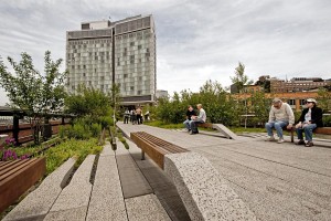 The High Line is a new park on an abandoned elevated rail track whose first stretch, from Gansevoort Street to 20th Street, has been opened at the beginning of June 2009. For decades, the rail viaduct lay unused and derelict, with the occasional photographers and other curious people climbing it for an adventurous stroll along a linear jungle surrounded by a jagged urban landscape. The idea to turn the viaduct into a park started to grow from just a few people to a community of interest, and was finally presented to the city. For New York, the idea came at the right time, since it is currently trying to breathe new life into the long-neglected west side of Manhattan, a landscape of parking lots, rail yards and an exhibition center that never attracted any noteworthy businesses in its trails. While the meatpacking district, once an agglomeration of butcheries and a redlight district, managed to turn into a super-hip area with designer shops and model clientele, the rest of the west side still lay in hibernation. Part of this is caused by the lack of transportation. While the Meatpacking district can be reached with a short walk from the station at 14th Street, there are no subway lines on the far west side of Manhattan, the system was never extended past Times Square and 8th Avenue. As part of several big infrastructure projects, the number 7 subway line is currently being extended westward from Times Square to tap the west side.
In this climate, the High Line park will certainly act as a catalyst, drawing people to the west side and, in the long run, attract new businesses and residents. The gentrification of the area is already underway, and will gain additional speed with the 7-line extension being finished.
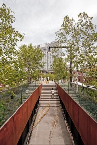 The park itself can be described as one of Manhattan’s most interesing parks. This comes in part from the elevation: walking on the level of the second or third floor is certainly a new experience. Since there are no high-rises in the area, you can see across the rooftops towards Midtown, Lower Manhattan and New Jersey, which makes for spectacular views. The plantation of the park was chosen to mimic the wild plants that grew here during the High Line’s hiatus. The pathways are made from concrete and sometimes wooden strips that seamlessly fade into the planted areas. Benches spring up in one integrated, curvy motion from the ground. Other benches are placed on wheels on rail tracks (which the High Line incorporeates as a reminder of its past) and can be moved along the tracks. At one place, there will be a theatre-like slope of benches towards a glass window opening to the street, with the sitting space being directly above the street, so you can sit and watch the spectacle of traffic below.
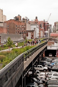 The building on the first photo is the new hotel “The Standard” which opened in March 2009. It is suspended on concrete pillars above the High-Line and it’s currently the only new building in the area to be situated directly above the new park. Being located in the Meatpacking District, it is a hip location for an upscale design-conscious clientele. The building was praised by New York Times’ architecture critic Nicolai Ourousoff, but its building quality seemed sub-standard to me. The exposed concrete parts of the building are cracked and very porous and some materials look cheap. From the photos that I’ve seen though, the interior is exquisitly styled and probably makes up for the shabby exterior. Since the area is somewhat run-down anyway, and with build quality in New York being generally pretty low, the building might fit into the cityscape in the end. A few blocks north though and visible from the High Line, Gehry’s IAC headquarters and Jean Nouvel’s nearly-fininshed apartment building add shiny modern contrasts to the area. Other new glass buildings are under construction as well, giving the area a strange hybrid feel between old and new. It’ll have to be seen how the gentrification transforms the area in the end.
The development of New York’s biggest spot of open land seems to turn into another urban planning failure.
On Wednesday, March 26th, real-estate company Tishman Speyer was selected by New York’s Metropolitan Transit Authority to develop the Westside Railyards, a 10.5 hectares (26 acres) industrial area on the west side of Manhattan. The decision followed a lengthy process in which five companies competed for this biggest patch of undeveloped land in Manhattan, which is about twice the size of Ground Zero. Ironically, the final decision was not based on the best urban vision for the area, but because the other four contenders dropped out of the race because of a lack of funds to subsidize the project due to the current financial crisis.
If you thought that architecturally, it couldn’t get any worse than the final plans for Ground Zero, then you’ll realize that the situation now has obviously bottomed out. The towers designed by Murphy/Jahn are completely unimaginative blocks whose only creative aspect is that they come in sets of two which are rotated 180 degrees to each other. The high-rise buildings flank the north and south sides of the area and cut it off from its surroundings, creating a canyon that does not integrate into the surrounding neighborhood in any way. This is as unimaginative as it gets, and this is what you get from a developer that wants the most bang for the buck as has no aspirations to create a stimulating urban environment.
In the past years or decades, New York has had its fair share of mislead urban planning projects. The redevelopment of Ground Zero has become the city’s most discouraging project after the developer chopped off more and more aspects of Daniel Libeskind’s original masterplan, turning the ambitious plan into nothing but money matter and run-of-the-mill architecture, and degrading the foregoing architectural competition into nothing more than a public show. in Brooklyn, the Atlantic Yards project, developed by architect Frank Gehry, is in the midst of being shrunk to a shadow of its former self, due to a lack of funds.
It looks like New York, boasting the famous and, at it’s time, trend-setting large scale development project Rockefeller Center, uses any chance it can get today to screw up contemporary projects of similar sizes. The plans get severely diluted, and the architecture ends up as something that shows no intention of setting new standards and doesn’t even seem to care about its role in this city that once was famous for its architecture.
Maybe there is a slight chance of hope though. Maybe not for Ground Zero, which already (though that word sounds so totally ironic in this context) is in the process of construction. But for the Hudson Yards, there are still countless years of planning ahead. With a lot of luck, there will be a shift in the plans until then, and the architecture might change as well during the process, as it is not carved in stone yet, so maybe it will change to the better. But much more important is that after all these painfully mislead projects, New York and its developers finally have to realize their failures and change their way of thinking and — this has to be said — shift their priorities from pure financial aspects towards a sense of responsibility in respect to the city and its inhabitants. They are constructing the New York of tomorrow, and they have to make sure the future New York lives up to the fame that the old New York had. And I express this hope even though “recent history teaches us […] that the project is only likely to get worse”, as written by New York Times’ architecture critic Nicolai Ouroussoff in this article.
(I was tempted to also mention the horrid project of a developer to turn a 1920’s building’s brown brick facade into a glass curtain wall, but that is a different story and it doesn’t fit into the scale of the projects described above, even though it still shows how ignorant some developers are in respect to the historical substance of the city. So if you want another dreadful story, read this article)
Louisville, Kentucky, USA is most probably not a city that’s on the radar of many people. The city of roughly 700.000 inhabitants located at the Ohio River is hardly known outside the US. This might change though, at least for people who are interested in architecture, since the city is the site for what is probably one of the most polarizing current architectural projects, “Museum Plaza”.
Originally planned as a new art museum and art center, it became soon clear that a fairly large selection of other uses for the building would be needed in order to come up with the running costs of the complex. In the end, it was decided to build a mixed use 62-story skyscraper including luxury condos, offices and a hotel besides the main art space. Since the contraints of the building site were very difficult, the New Yorker architectural office REX (led by Joshua Prince-Ramus, who was once a partner of Rem Koolhas at OMA) had to turn usual architecture standards upside down, in the truest sense of the word.
REX’s project website shows an (at first sight) somewhat ugly and non-proportional building. It takes some time and explanation to get behind the idea of this building and see why it’s special and what makes up the actual concept. And that concept is explained by Joshua Prince-Ramus at TED TALKS, the video of which can be seen at the company’s website. Prince-Ramus talks about three different projects, Musum Plaza is the last one, about two thirds into the video. The solution of lifting the public parts of the building way up into the air becomes clear as he talks about the constraints and circumstances of the project. From this perspective, the clumsy building seems to fulfill its intention and will also provide a new architectural landmark that will probably give a boost Louisville’s reputation (at least, I would like to see that monstrous building in person).
The video and presentation finishes with an animation about Museum Plaza that is very well worth seeing, even if you’re not interested in the architecture itself. The way the video was filmed and the way it seamlessly combines shaky hand-camera filming with rendered and animation sequences is breathtaking. If you don’t want to load that whole video to see this, you could also see the video at YouTube, albeit with a much worse quality.