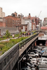
Archive for September, 2009


Chop Off That Top! How to Turn Manhattan Into an Architectural Museum

Jean Nouvel’s proposed tower next to the Museum of Modern Art in New York was one of the most promising buildings to rise in Manhattan in the next years. Now, New York’s City Planning Department knocked the building into shape due to doubts concerning its architectural excellence.

New York is having a tough ride. After a long time of architectural blandness, the excess of the years before the current credit crisis blessed the city with some fairly innovative and beautifully modern building proposals. When the crisis reached its peak though, many of these sketches were away for financial reasons. One example for this is Herzog and de Meuron’s Jenga-style glass tower. Others barely survived the credit crunch: Frank Gehry’s Beekman Tower is under construction — albeit modified for a smaller budget — and is turning into a massive building that will redefine the Lower Manhattan skyline.

And what cheer went through the architectural scene when Pritzer price winner Jean Nouvel revealed his plans for a 75-storey building at 53rd street, right next to the Museum of Modern art (which would actually use some of the buildings’ floors to expand its exhibition space). The tower slopes back dramatically as it soars into the sky, supported by a network of irregular steel beams, the glass facade flush with the steel. The building would have reached a height of 381 meters, teh height of the Empire State Building without its spire. The proposal had the power to become New York’s next architectural icon, on par (not just in size) with giants like the Empire State and the Chrysler Building. But this is obviously something that not everybody was happy with.

On Wednesday, September 9, New York’s City Planning Department rejected the proposal and demanded that the building be cut by 61 meters (200 feet). According to city planning commissioner Amanda Burden, the building (or its top) does not meet the aesthetic standards that would be necessary for a building that wants to compete with New York’s most famous landmarks.

This instantly reminded me of Hamburg’s mentality towards modern high-rise architecture. Somewhere in the 1960’s, after the first huge corporate office buildings had been built in the inner city (the Unilever building at Gänsemarkt had been a kind of guinea pig), the city administration came to the conclusion that no building in Hamburg should compete with the main churches that define the city’s skyline. This has become a rule that exists until today. With its decision to restrict the height for Nouvel’s tower, New York has arrived where Hamburg had been in the 1960’s. For New York nowadays, the Empire State and the Chrysler resemble Hamburg’s churches — fixed points on the skyline that may never be matched or exceeded by modern architecture. In this, New York, the classical city of skyscrapers and the city that embodies the constantly changing and growing urban environment, seems to finally put an end to its strive for architectural greatness in order to freeze its skyline in time, turning its buildings into artworks in an urban museum that shows how the city looked in its golden years, yet closes itself to new architectural influences.

What’s unusual in the Planning Departmernt’s decision is that they obviously didn’t even ask Nouvel to rework his proposal to better fit its location. They criticized the top of the building, but gave Nouvel no chance to fulfill their demands by reworking the spire. Instead presented Nouvel with a fait accompli. This might lead us to the conclusion that there might be forced trying to stop the building from being erected. It’s not clear whether the action was sparked by a kind of NIMBY initiative or other people. What seems clear though is that the design for the building will see some massive changes that might affect its overall stature. Since this is not your regular building, but one of the most promising current projects in Manhattan, the sad conclusion is that New York in the present time cringes from redefining itself, like it has done so often before.

Further reading: Off With Its Top! City Cuts Tower to Size — The New York Times, September 9, 2009
The High Line is a Highlight

A disused elevated railway viaduct in New York City was recently turned in a remarkable park and public space.

The High Line is a new park on an abandoned elevated rail track whose first stretch, from Gansevoort Street to 20th Street, has been opened at the beginning of June 2009. For decades, the rail viaduct lay unused and derelict, with the occasional photographers and other curious people climbing it for an adventurous stroll along a linear jungle surrounded by a jagged urban landscape. The idea to turn the viaduct into a park started to grow from just a few people to a community of interest, and was finally presented to the city. For New York, the idea came at the right time, since it is currently trying to breathe new life into the long-neglected west side of Manhattan, a landscape of parking lots, rail yards and an exhibition center that never attracted any noteworthy businesses in its trails. While the meatpacking district, once an agglomeration of butcheries and a redlight district, managed to turn into a super-hip area with designer shops and model clientele, the rest of the west side still lay in hibernation. Part of this is caused by the lack of transportation. While the Meatpacking district can be reached with a short walk from the station at 14th Street, there are no subway lines on the far west side of Manhattan, the system was never extended past Times Square and 8th Avenue. As part of several big infrastructure projects, the number 7 subway line is currently being extended westward from Times Square to tap the west side.

In this climate, the High Line park will certainly act as a catalyst, drawing people to the west side and, in the long run, attract new businesses and residents. The gentrification of the area is already underway, and will gain additional speed with the 7-line extension being finished.

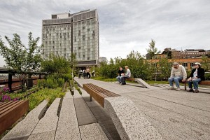
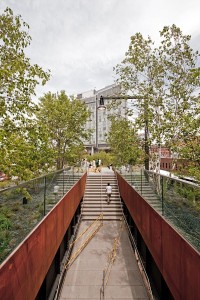
The park itself can be described as one of Manhattan’s most interesing parks. This comes in part from the elevation: walking on the level of the second or third floor is certainly a new experience. Since there are no high-rises in the area, you can see across the rooftops towards Midtown, Lower Manhattan and New Jersey, which makes for spectacular views. The plantation of the park was chosen to mimic the wild plants that grew here during the High Line’s hiatus. The pathways are made from concrete and sometimes wooden strips that seamlessly fade into the planted areas. Benches spring up in one integrated, curvy motion from the ground. Other benches are placed on wheels on rail tracks (which the High Line incorporeates as a reminder of its past) and can be moved along the tracks. At one place, there will be a theatre-like slope of benches towards a glass window opening to the street, with the sitting space being directly above the street, so you can sit and watch the spectacle of traffic below.

The building on the first photo is the new hotel “The Standard” which opened in March 2009. It is suspended on concrete pillars above the High-Line and it’s currently the only new building in the area to be situated directly above the new park. Being located in the Meatpacking District, it is a hip location for an upscale design-conscious clientele. The building was praised by New York Times’ architecture critic Nicolai Ourousoff, but its building quality seemed sub-standard to me. The exposed concrete parts of the building are cracked and very porous and some materials look cheap. From the photos that I’ve seen though, the interior is exquisitly styled and probably makes up for the shabby exterior. Since the area is somewhat run-down anyway, and with build quality in New York being generally pretty low, the building might fit into the cityscape in the end. A few blocks north though and visible from the High Line, Gehry’s IAC headquarters and Jean Nouvel’s nearly-fininshed apartment building add shiny modern contrasts to the area. Other new glass buildings are under construction as well, giving the area a strange hybrid feel between old and new. It’ll have to be seen how the gentrification transforms the area in the end.

All content © by Tobias Münch.
On Architecture – A Kotogoto Project